Serenity Simplified helps people turn their homes into calm, joyful spaces through personalized home organization. Their three-step method, Clear the Clutter, Find Your Flow, and Decode Your Decor, is all about creating a more peaceful, intentional way of living at home.
SCOPE OF WORK
Brand Design
Logo Design
Logo Design
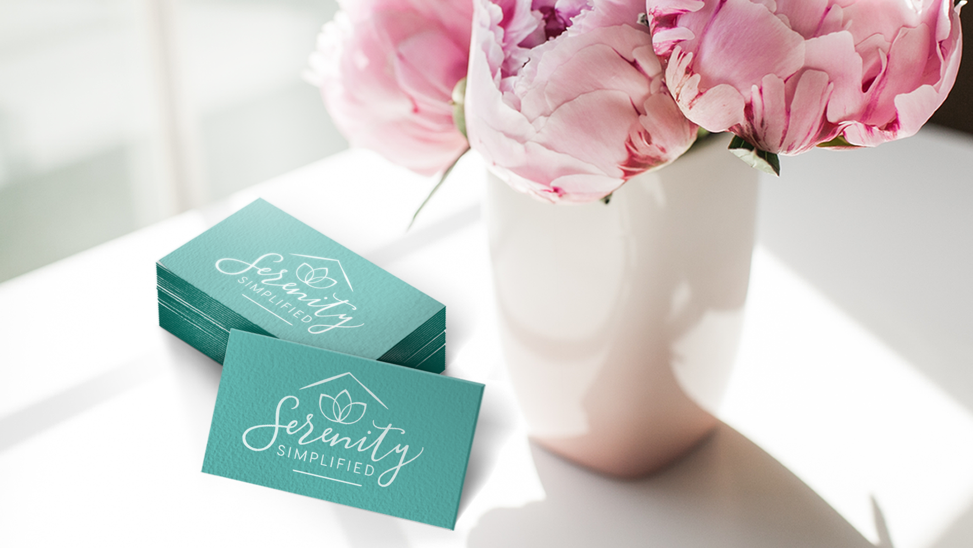
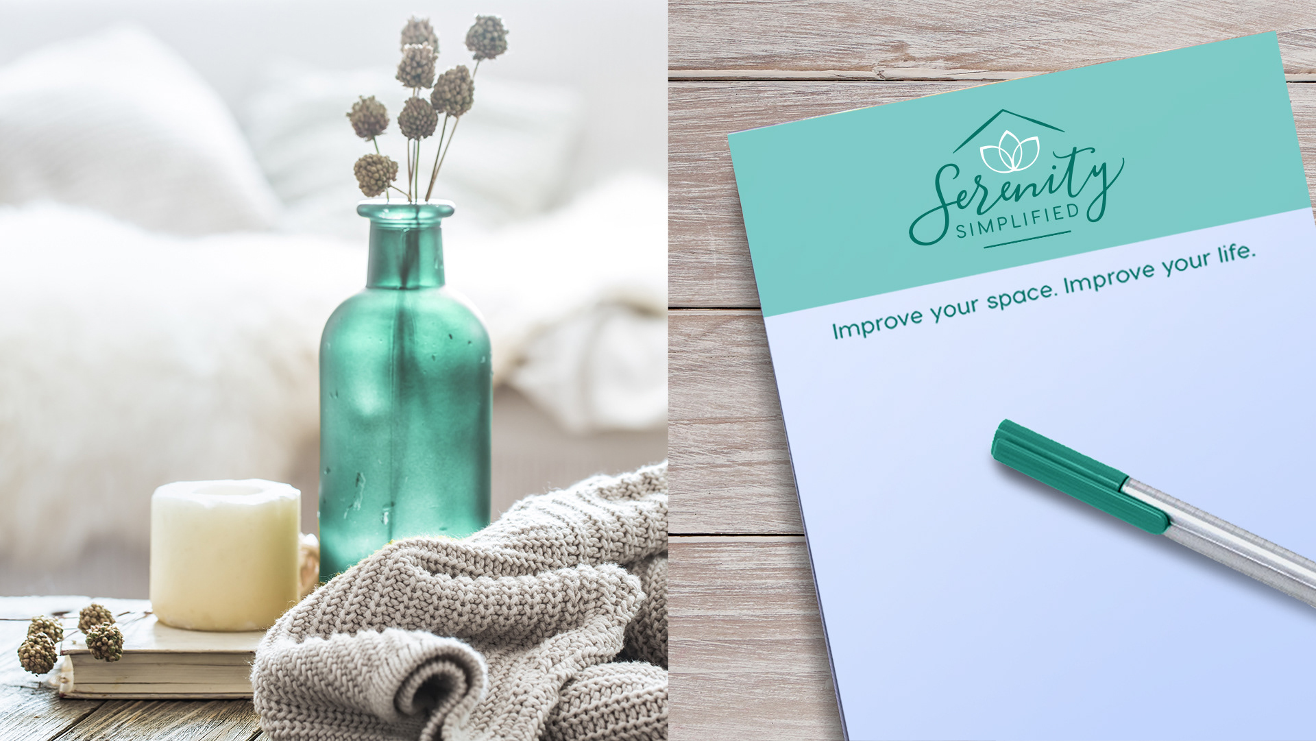
The client came in with a clear vision: a flowing script-style logo that felt serene. To deliver on that, I paired a graceful but legible calligraphy font for “Serenity” to convey flow, and a clean sans serif for “Simplified” to reflect the simplicity at the heart of their home organizing approach. They also asked for a floral element and a subtle nod to a house, so I combined a delicate, symmetrical flower with a minimal house-shaped outline to frame the logo. We chose a calming teal palette together to complete the peaceful feel.