
The Natural History Museum of Los Angeles County is a highly respected institution in California known for its engaging exhibitions about the natural world. The museum’s gift stores offer custom-designed souvenir products inspired directly by these exhibitions, giving visitors a meaningful way to take home a piece of their experience.
SCOPE OF WORK
Creative Ideation and Direction
Retail Product Design
Packaging Design
Management of Multidisciplinary Team
Retail Product Design
Packaging Design
Management of Multidisciplinary Team
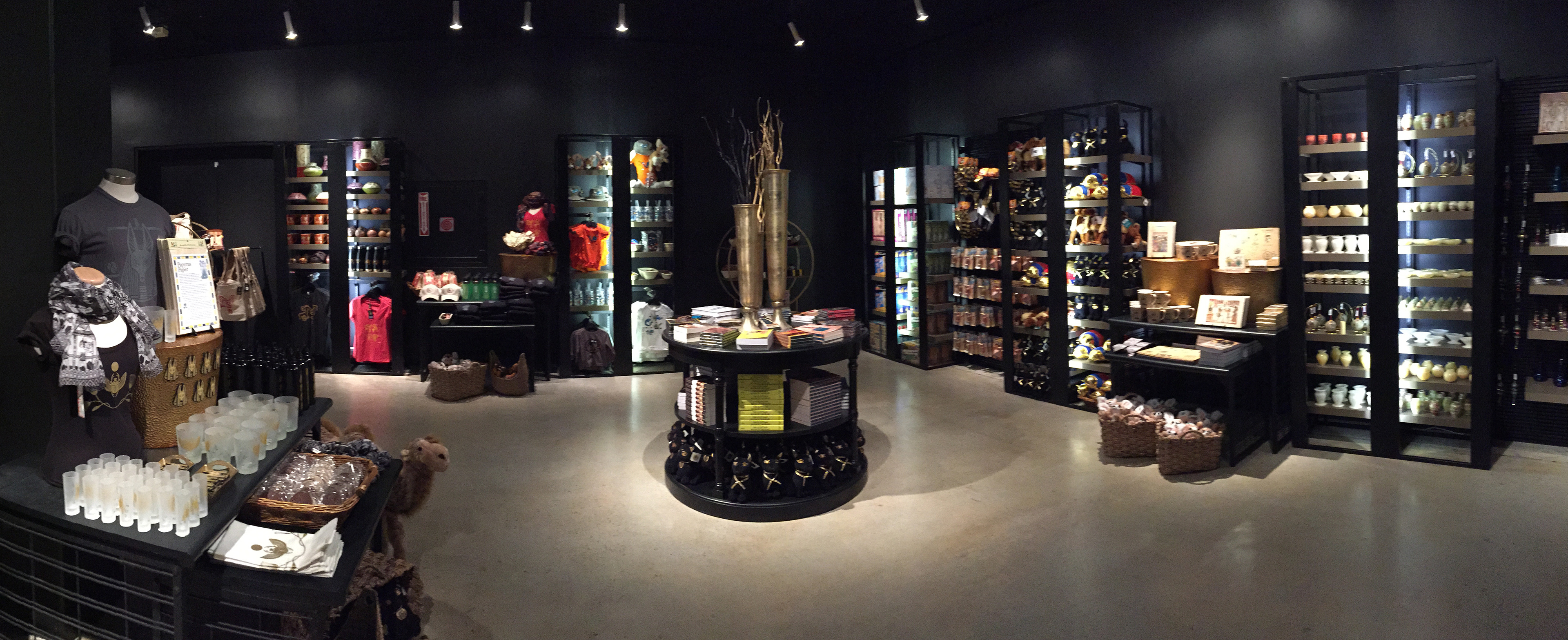
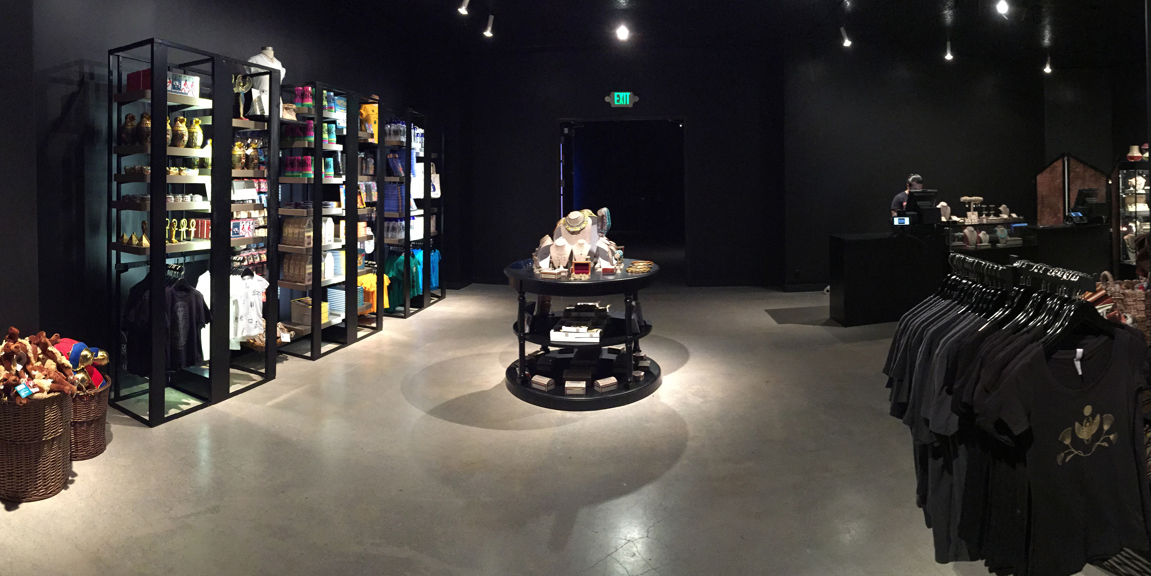
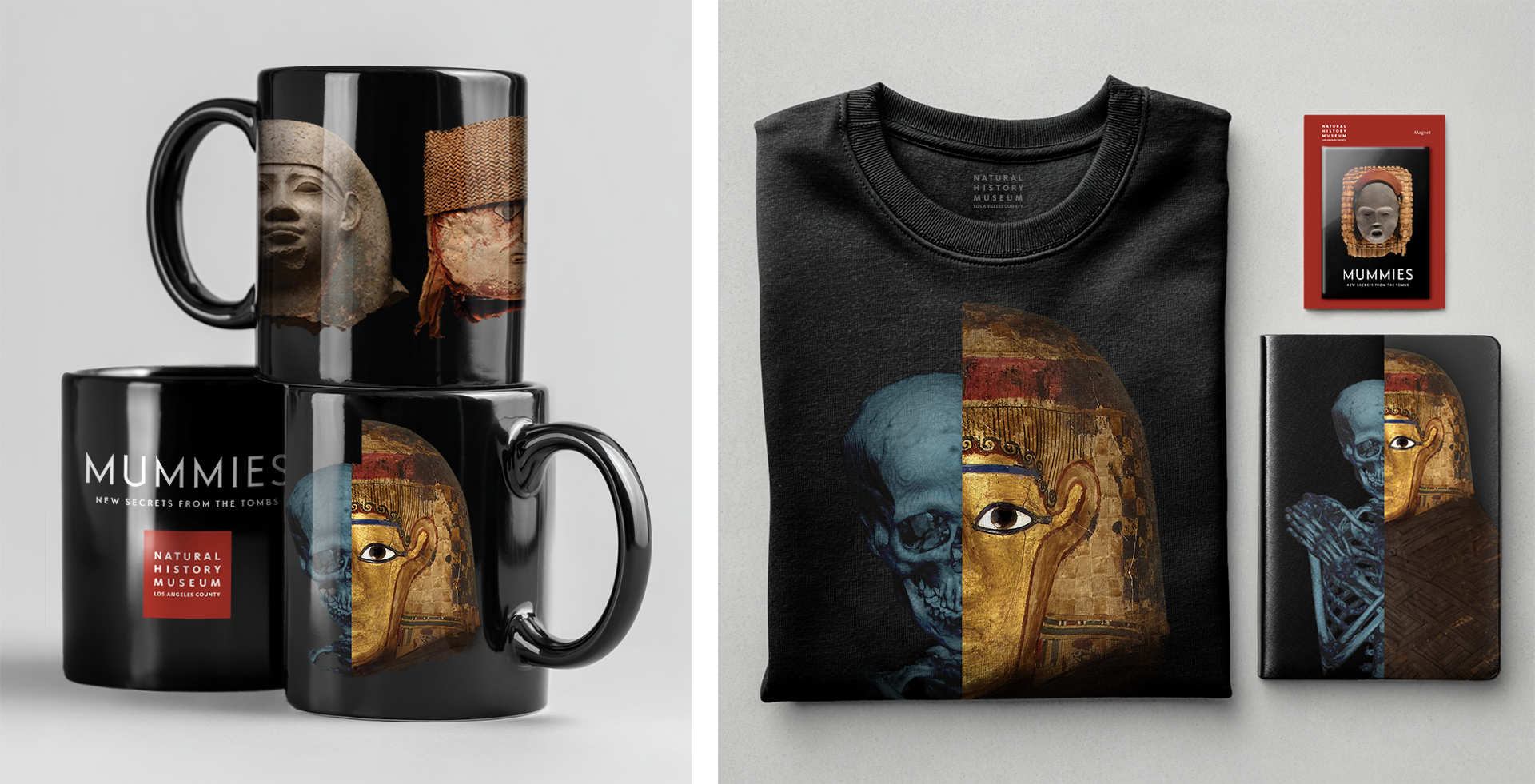
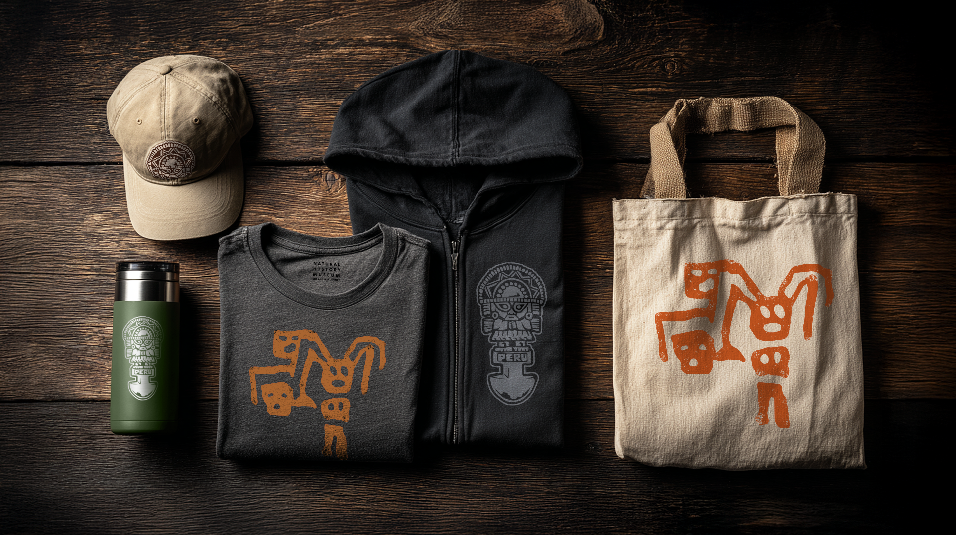
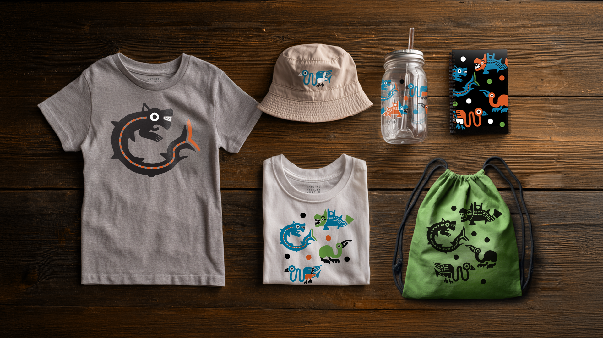
For the traveling exhibition Mummies: New Secrets From the Tombs, I was brought in as Creative Director to ideate and develop six distinct merchandise collections for the museum's exhibition gift shop. Each collection was distinctive while remaining cohesive when displayed together. I led a team of designers, illustrators, and production artists who executed my vision through every phase, from artwork development to product layout to production.
Challenges included a tight timeline, a strict directive from the museum not to feature wrapped mummies, and the need to represent two distinct cultures (Egypt and Peru). The museum also requested that the exhibition’s scientific focus, specifically the use of CT scan technology to study mummies non-invasively, be highlighted while still ensuring the products would appeal to visitors.
Each item required approval from the museum's art director and curators to ensure design quality and cultural accuracy. All six collections were produced on time and successfully launched for the exhibition’s opening.
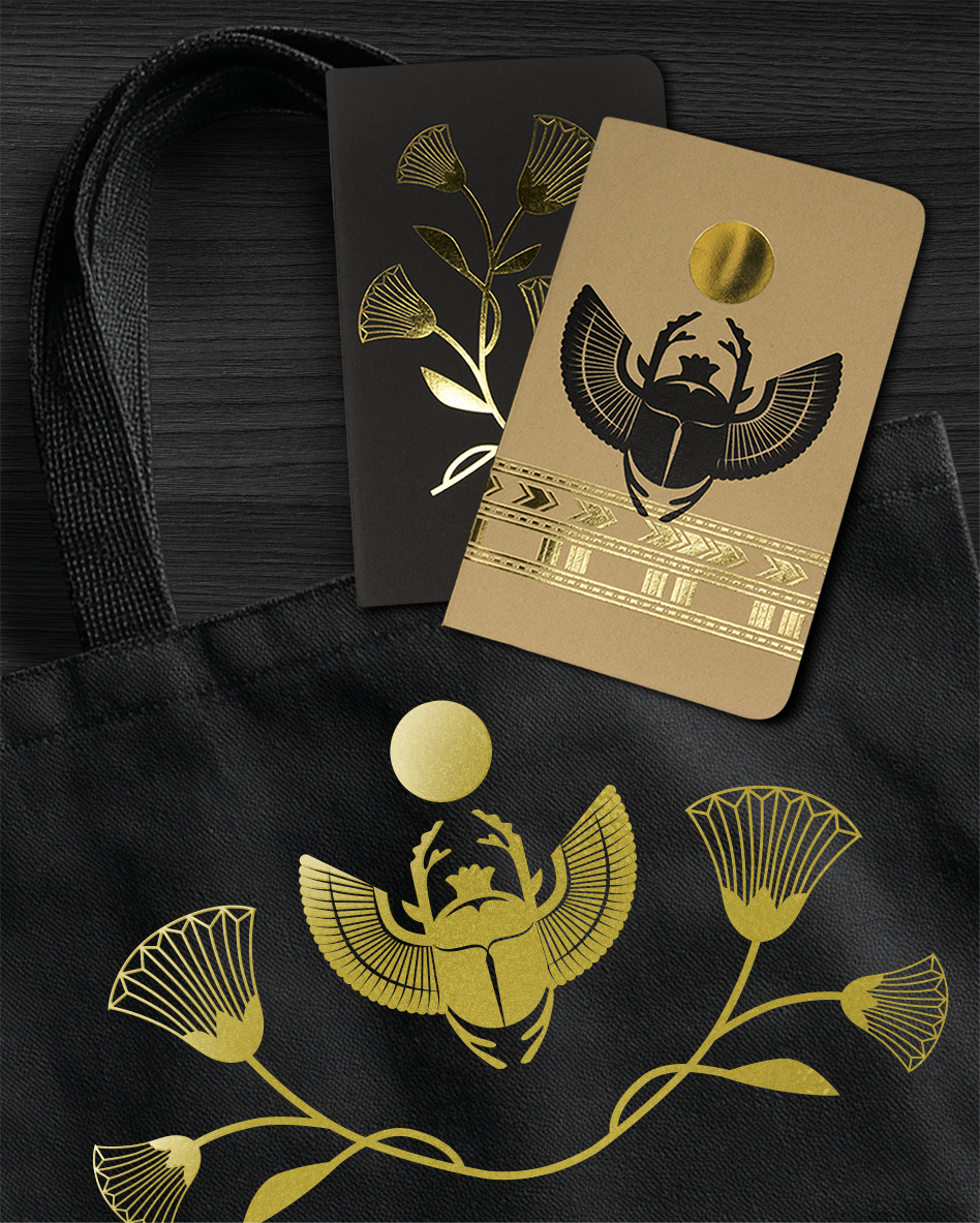
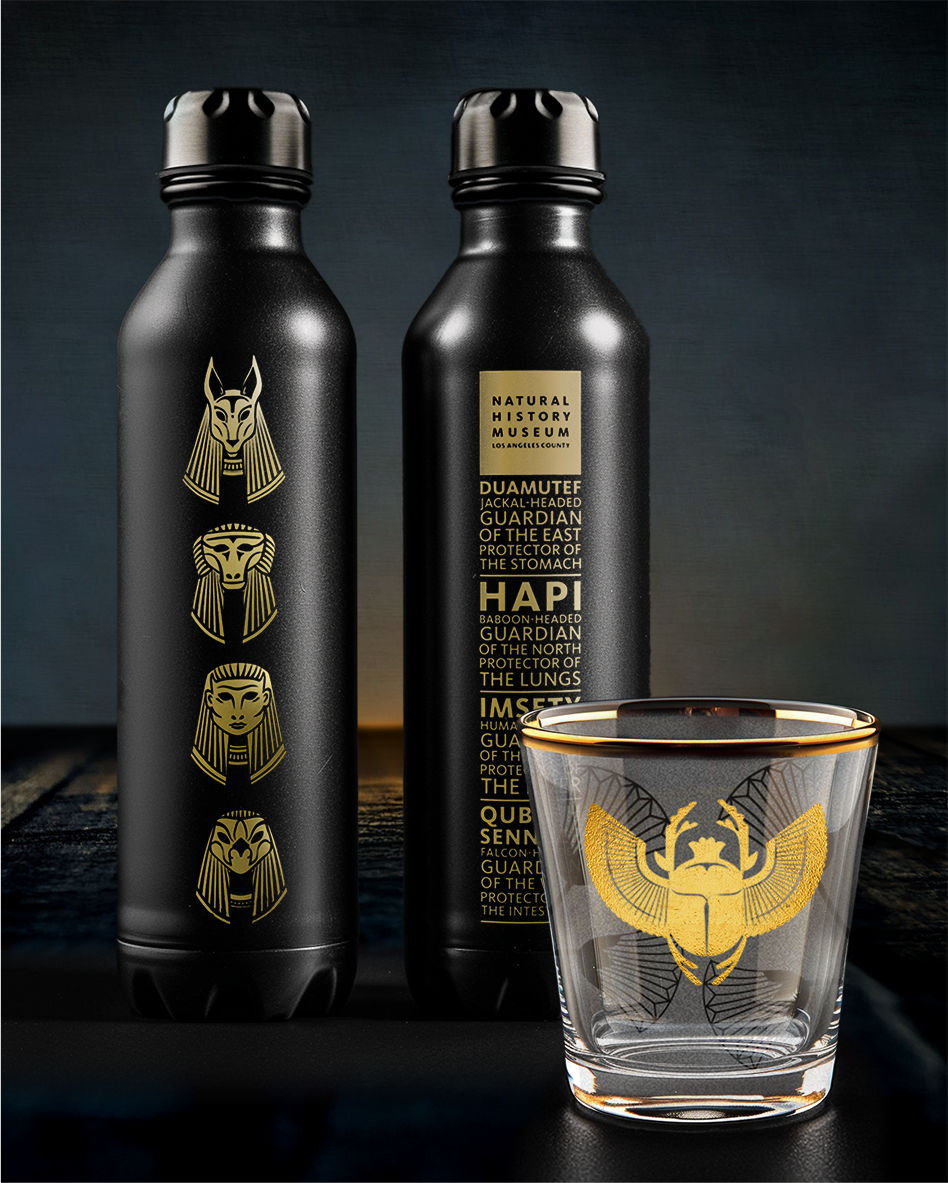
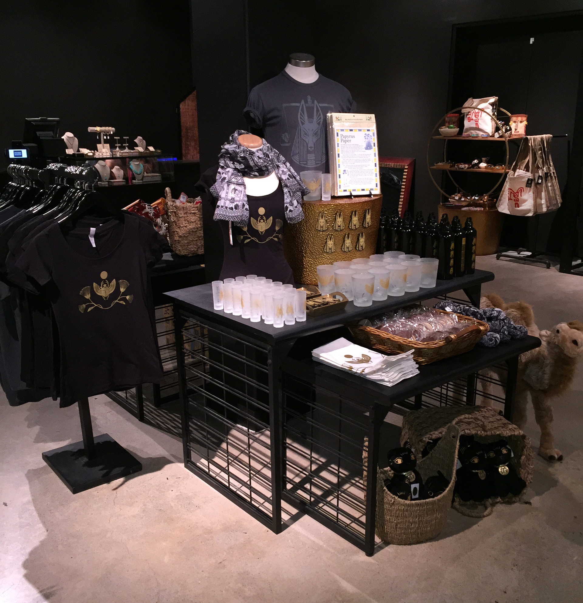
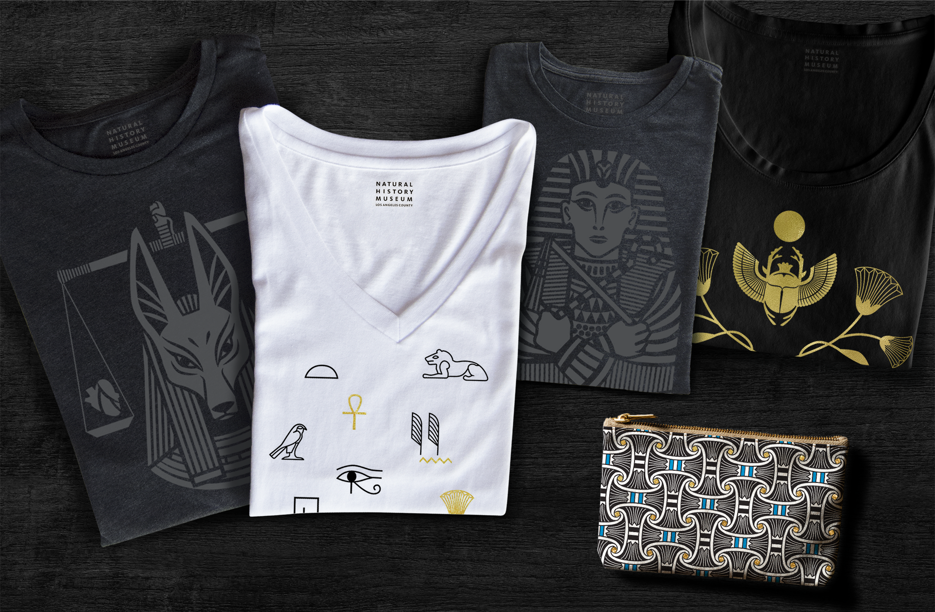
This custom collection draws inspiration from ancient Egypt, featuring a sophisticated visual style with clean, bold illustrations and a refined black, gold, and white palette designed to appeal to adults. Iconography tied to Egyptian culture, including mummification and tomb imagery, was incorporated to reflect the history of the funerary process. I worked closely with illustrators and designers to guide the artwork’s creation and application across products, delivering a fresh, elegant alternative to typical mummy-themed merchandise.
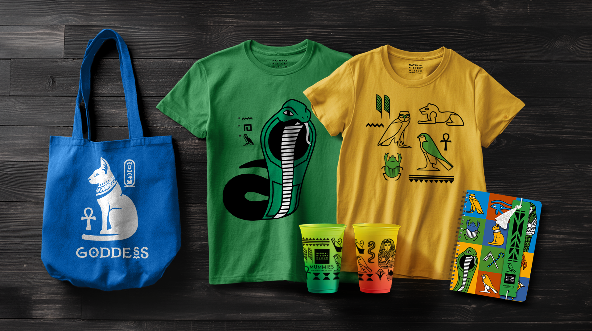
With bold, clean designs in a vibrant palette of blue, green, yellow, red, and black, I guided our team of illustrators and designers in creating kid-friendly artwork inspired by ancient Egyptian iconography, such as the cat goddess, cobras, hieroglyphics, and sarcophagi. The goal was to appeal to younger visitors while staying true to the exhibition’s themes.
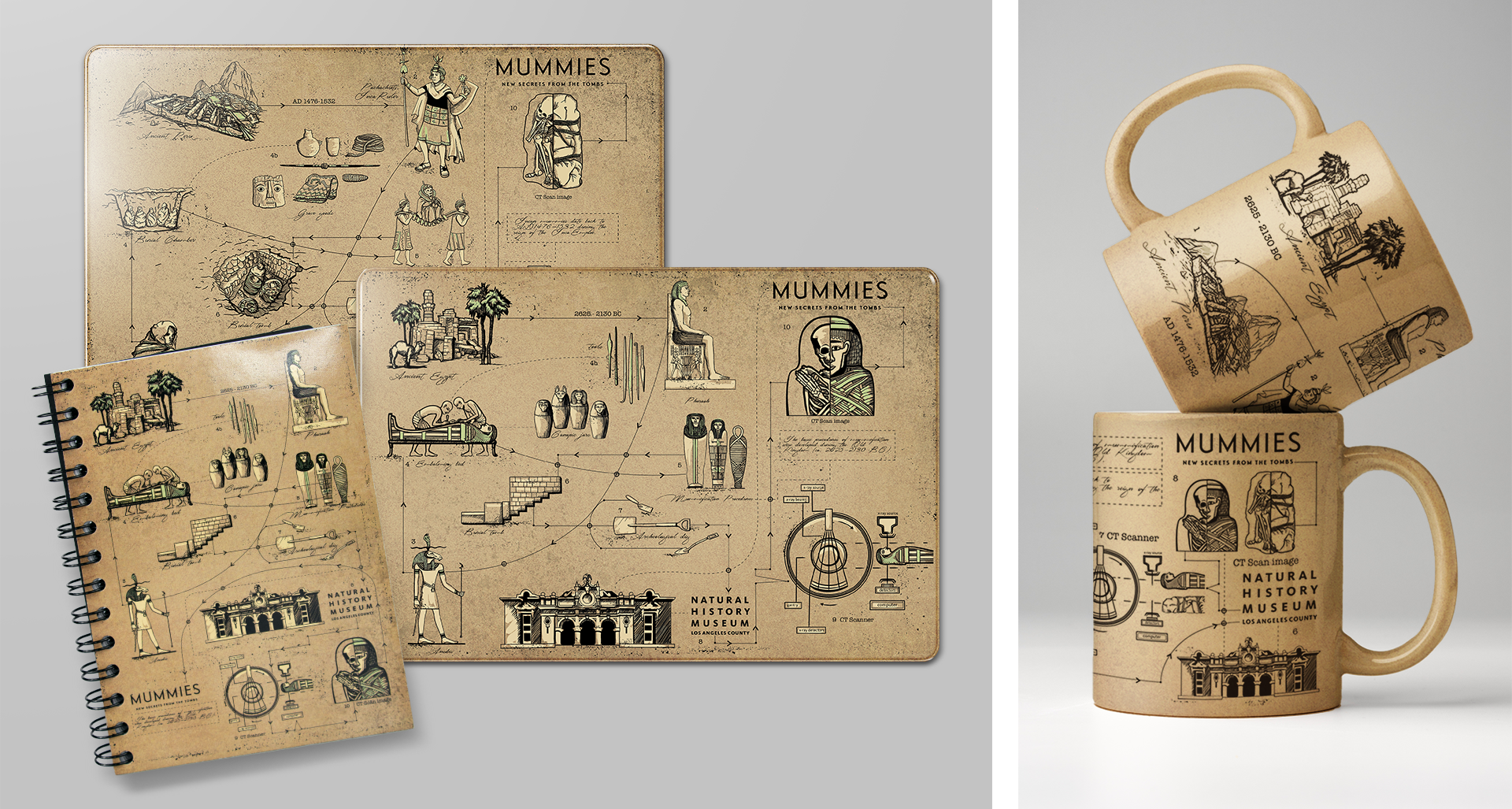
The dual culture collection was the most challenging, as it needed to reflect the exhibition’s focus on CT scanning in a way that worked for retail products. I guided our illustrators in creating dual timelines, one Egyptian and one Peruvian, detailing each culture’s mummification practices, archaeological excavation, scientific scanning process, and arrival at the museum. We then applied the concept by laying out the timelines dynamically across product formats.
Featuring original photography of artifacts and mummies provided by the exhibition director, I guided the design team to thoughtfully apply these images across products, ensuring each piece aligned with the exhibition’s brand identity.
A challenge in creating custom products for ancient Peruvian culture was the limited reference materials on iconography and artifacts. Our illustrators developed artwork inspired by Paracas geoglyphs and Tumi artifacts based on the available references. To ensure cultural sensitivity and respect, we sought and received explicit approval from the museum’s art director and curators to use the Peruvian iconography in this way before moving forward. Once approved, my team applied the artwork across a variety of products, creating a meaningful connection to the ancient Peruvian culture featured in the exhibition.
For the kids’ collection, we created custom designs inspired by Nazca pottery to connect with the ancient Peruvian culture featured in the exhibition, as reference material was limited. To ensure cultural respect, we sought and received explicit approval from the museum’s art director and curators before applying this iconography across products. The collection features a kid-friendly palette of green, black, orange, and blue.
The gift shop, located at the exit of the exhibition, was designed to extend the immersive experience with moody black lighting and cohesive exhibition branding. This atmosphere allowed the custom product collections to seamlessly integrate with market product procured by the buying team, creating a unified and engaging retail environment for visitors.